

LRPS (Licentiateship of Royal Photographic Society)
Obtaining my LRPS took me through several stages in my photographic development. I regard myself as an experienced amateur photographer however the nuances and exacting standards required to obtain a distinction, highlighted my over relaxed approach.
I have created this section on my web site in the hope that it may help future applicants seeking an LRPS distinction. This is also a cathartic exercise for myself and has helped me understand why I had not succeeded first time around.
Click on the links in the right hand column to see each stage with images and comments. Click on the picture titles to see a full size image.
LRPS 'The start'
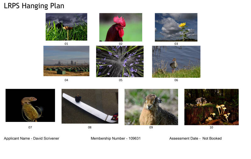
My first submission for online advice - June 2018
Place the fungus on image 1 on a left third of the picture and the first row works. Image 4 and 6 do not work well together as book ends: the subjects, composition and tones are too dissimilar. In row 3, image 7, the field mouse should be placed on the left third to improve the composition to make it an effective bookend. Image 8 is too urban and different from the rest of the panel. The hare, image 9, is too big compared to the vole and thus dominates the row.
Well received but fungi too central with blown highlights and very bright green, blades of grass that are distracting and require toning down.
Good colours and again positive feedback. Suggest crop out the feathers on the birds back just behind the head. Focus is a bit soft on the beak and eye.
Similar comments to image 1. Tone down the stem, the head needs to be sharper with more detail in the petals. Clone out the bee as it may be mistaken for a dust spot.
Good composition. No detail in shadows on the back of the huts, crop the sky for better composition.
Unusual but interesting composition. Flash too strong and has blown the detail in the bluebells. The blades of foliage also too bright. (I like this image and so decided to retake the shot taking care not to over expose the foreground and if possible use in a later panel).
The Red Shank is too small in the frame and surroundings are not sufficiently interesting to add value to the image. Distracting straw in front of the body requires cloning.
'Charming' picture but would be better as portrait format. The teasel head and spines are too bright detracting from the subject.
An interesting image and well seen but perhaps not acceptable to all LRPS judges because of the negative space between the two subjects. Distracting soil patch in top right corner could be cloned out.
The hare is too central in the frame and eyes are softer than the nose. The eyes should be the focal point in this image.
Good composition and lighting but the foreground and scene generally is too untidy. 'Gardening' could have been carried out to tidy the scene.